Helping 70 million letters find their way home.
2021
Client
Postnord — Adressändring
About the client
Over 600.000 people in Sweden use Adressändring.se yearly to make sure they get their mail to the right time and place, because of for example a move or a vacation. Adressändring is owned by Swedens biggest mail delivery service, Postnord.
The Challenge
In a survey prior to the project showed some reoccurring feedback about that Adressändring’s different services are difficult to understand and when they are relevant for the customer’s situation. The feedback also included that they are not recognisable enough through the whole customer journey which makes it feel less safe.
With these insights Andressändring who is owned by Postnord wanted to update both the visual brand and the user experience of their digital product.


The Goal
- Make it easy to understand which services Adressändring offer and when they fit and for who.
- A more recognisable and inclusive brand identity through out the whole customer journey.
We decided to set the different services more from the customers perspective and there for labeled them as life situations, “Livssituationer”. We also introduced guide articles as a way to even more explain when and for who the different services is a fitting choice. These articles also opens up for Adressändring to give general tips to fill a bigger purpose around relevant topics.


The Goal
The core concept was about Adressändring’s duality—a sender and a receiver, a motion from A to B. To own it at the core the well established logo (in Sweden) was adjusted to have only the colours red and blue, derived from the logo.
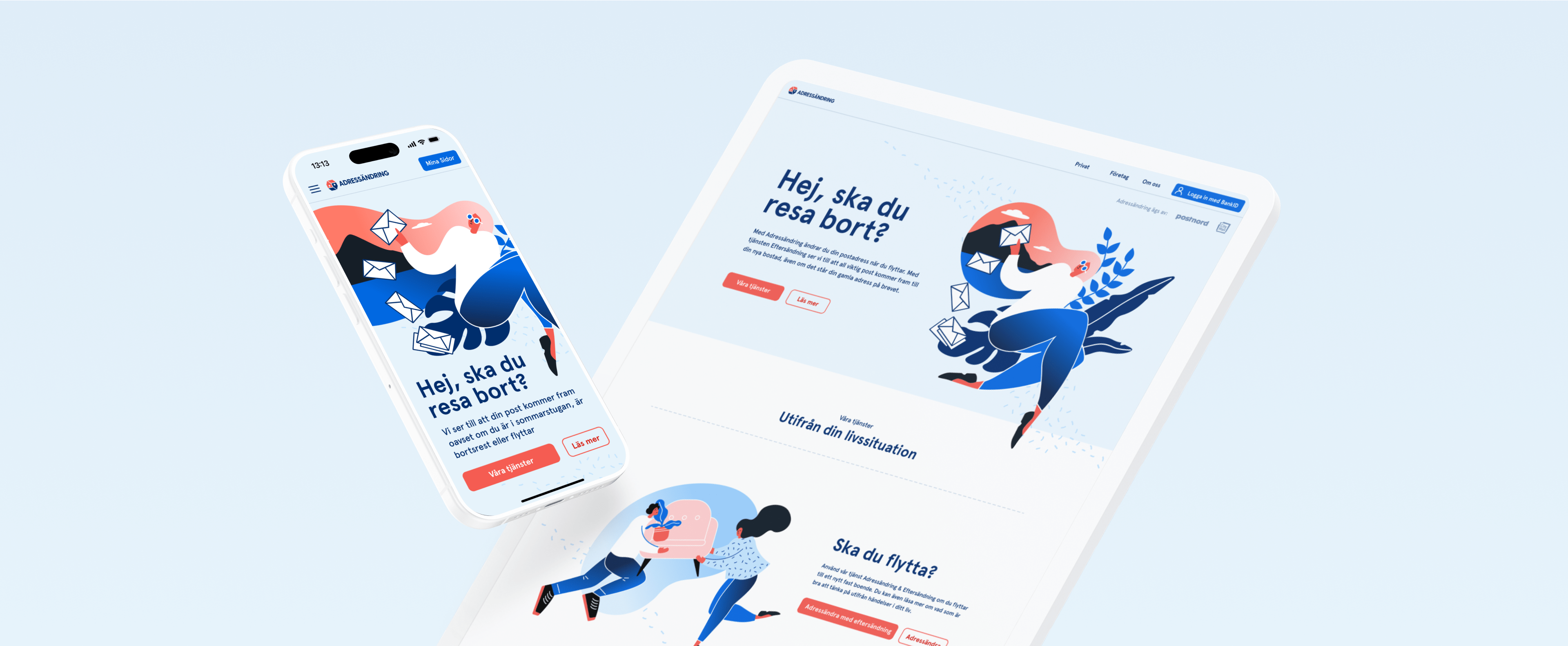
A limitation during the project was that they did not have a photo library and they couldn’t afford to have a photoshoot nor buy many stock photos either. We came up with the cost efficient and visually strong solution to buy a vector illustration package which we customised and built numerous variants to fit Adressändring’s business context and brand.
The illustration style also follows the concept “from A to B”. They are floating in the air, so they constantly are “on the move”. The skin-type and body types are also set in a surrealistic style to not portray the reality from 1:1, as a way to be more inclusive for the whole audience that actually lives in Sweden.


Design System
A design system was built within Figma with tokens to serve the development in a efficient way. It was built according to the Atomic Design Methodology. Figma actually also included the design system for all the marketing brand assets as well.

UI experience
Prior to the project, Adressändring’s landing page was limited to a static, above-the-fold-only layout. Early in the process, we identified this as a missed opportunity to better engage users from the first point of contact. A well-designed landing page serves as an extension of the main navigation—much like a movie trailer sets the tone and invites further exploration.


The Result
The updated brand identity significantly increased brand recognition, using a distinctive duotone color scheme and an inclusive illustration style. This also contributed to a more visually consistent and cohesive experience throughout the entire customer journey.
After launching the improved online platform, Adressändring’s customer service reported a 30% reduction in incoming calls. The new design made it easier for users to understand who the services are for, when to use them, and why they matter.


From the Client
”We have more than 2 million visitors every year. With these new intuitive user flows, more precise communication and a new visual identity, our service has become much easier and more fun to use.”
Carin Andersson CEO, Svensk Adressändring


