A science-backed membership for better health.
2020
Client
Schibsted — Wellobe
About the client
Wellobe is a health and weight loss membership that includes personal trainers, certified dieticians, sport camps and an smartphone app. The service have helped over 500.000 people since it was founded in 2003 in a collaboration with Karolinska Institutet.
The challenge
A survey conducted among members revealed that the service felt outdated and generic. They were losing members to international competitors with more memorable and visually appealing brands. The current name, ”Viktklubb,” wasn’t helping either.
Members also expressed a desire for more customisation features and the ability to create their own content, to make logging food and workouts smoother and more personal.
As a result, Schibsted wanted to update the name, the visual identity, and the user experience of their digital weight loss service.


The Goal
- Add customisable features that speeds up the food logging process.
- A more updated brand identity that take inspiration from the service’s strengths which is the scientific method and real experts
- A new name that sound more fresh and less like a 90s magazine subscription
We decided to improve the features around copying and customising recipes that originally have been made by licensed dieticians. Adding grocery list features to save time. Improving the usage of rating and favourite tagging and many more little things.


The Brand identity
After numerous workshops we landed together with the name Wellobe, which take inspiration from the wellness trend.
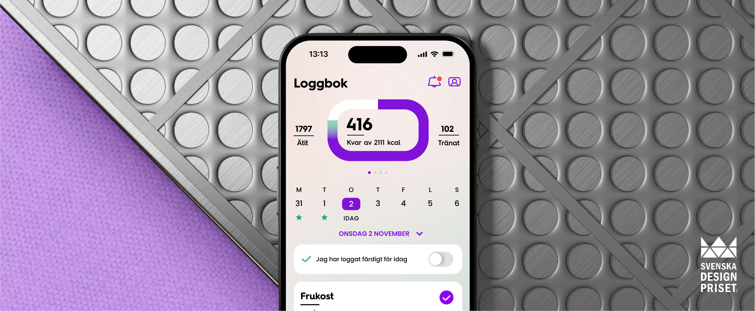
The core concept of the brand identity was based on the idea that in all weigh-loss apps the main piechart is essential. We landed on an uncommon shape for a circular piechart but still function for the purpose. A generously rounded rectangle. A shape that efficiently can be reused in an UI in, image croppings, in photos of lunchbox recipes, in icons, even within the word-mark.
A limitation during the project was that we could only set directions for future recipes’ photoshoots but not actually doing a food photoshoot within the project.
We also had to keep the app’s current typeface, Poppins, for the app’s body copy and labels.


Design System
Assets for the design system were strived to be styled in a rounded rectangular way. for example icons, tags, cards and image crops.


UI experience
The original app had red as their primary color, which they had a lot of difficulties with. So it was warm welcomed when we suggested to go into a more modern and fresh color spectrum of purple.


Summary
By introducing distinct visual components, the new look created a cohesive experience that tied together every user touchpoint—from the app to digital marketing channels and the physical world.


The Result
The app’s updated features, user interface and new name, Wellobe, made Schibsted’s weight-loss service more attractive to a wider audience. A significantly larger amount of 25-35 year old people signed up to the service after the launch campaign compared to previous campaigns.